The problem
Room to grow
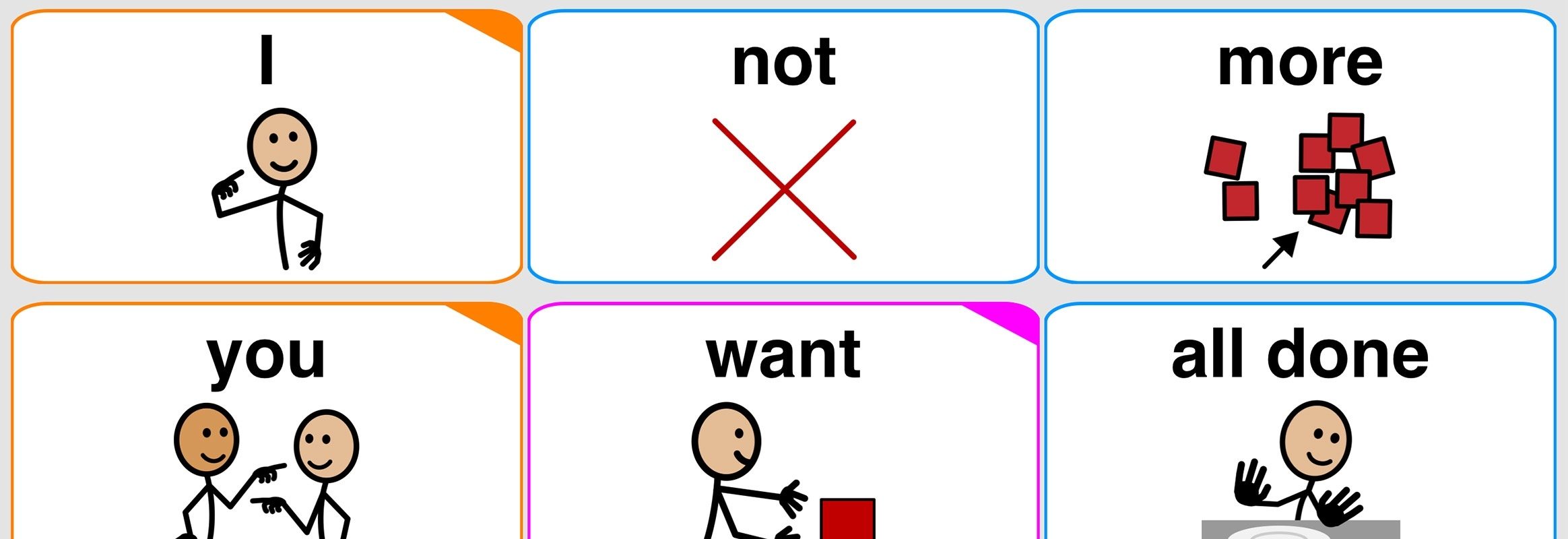
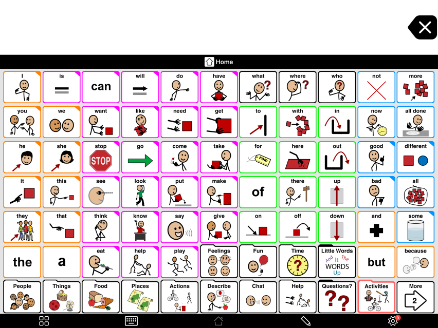
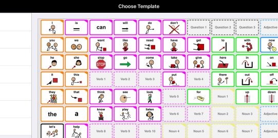
An AAC system should always have more vocabulary than the individual is currently using or understands in order to provide room to grow. This “extra” vocabulary is also essential for Aided Language Input, a simple teaching strategy where you use the individual’s device yourself while talking with him or her. Also, the more vocabulary on a single page, the less navigation to other pages will be required to find the words you need.
Every user is different
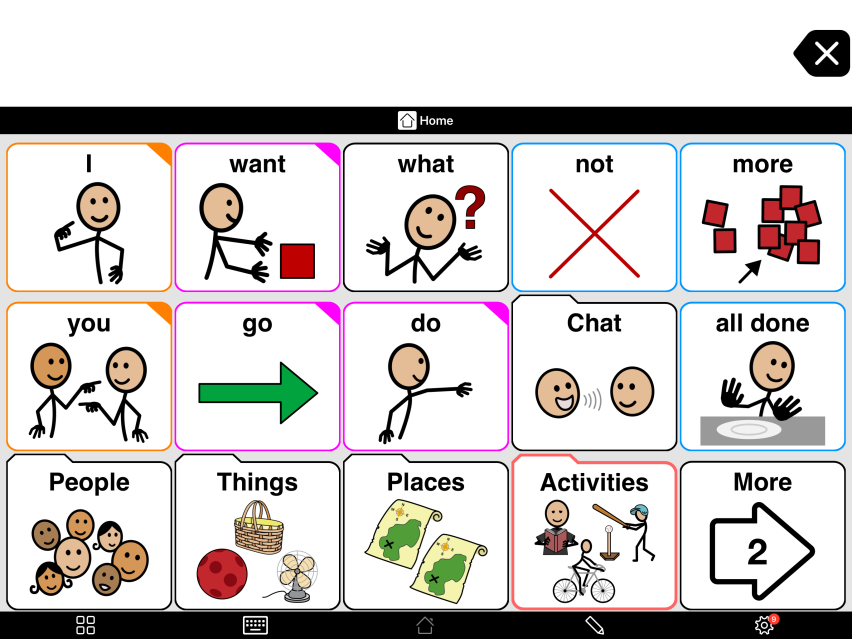
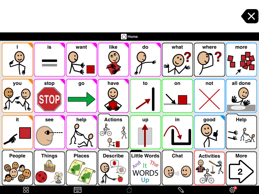
An ideal grid layout should provide the user access to as much language as possible on a single screen. At the same time, the buttons should not be so small or the visual design of the screen so complex that the user cannot find and touch the words he or she needs. The optimal balance will vary from user to user, and will change over time as the skills of the user grow.
Stuck in the wrong vocabulary
Traditionally, comprehensive AAC vocabularies include separate versions optimized for different language and motor skills. To support effective communication, it is important that the user moves to a higher vocabulary level with more buttons per page as their cognitive, language and fine-motor skills develop. However, because the vocabulary for each version is completely separate in these traditional systems, customizations made for one level need to be redone in the next level. As this "reprogramming" is time consuming, it often doesn’t happen, leaving AAC communicators “stuck” at a language level that doesn’t allow them to reach their full communicative potential.
Adjustable grid sizes
The challenge
To have a vocabulary that could easily grow with the user, we wanted to develop a system for Proloquo2Go that would be easily adjustable for the widely varying needs of our individual users. We also wanted a system where the grid size could be easily changed as the user's needs and abilities changed, without losing any customizations. The solution we found was adjustable grid sizes.
