How did we make Proloquo extremely efficient?

  • 6 minute read

AAC is always slower than speech so a good AAC system needs to be as efficient as possible to make it easier to participate in conversations. In this blogpost we explain how we were able to make Proloquo® really efficient. As part of the “Proloquo explained” blog series, it is written for anyone who wants an in-depth explanation of the design of the new Proloquo AAC app.

An optimized vocabulary

Proloquo’s Crescendo Evolution™ is a robust, innovative vocabulary. It includes more than quadruple the words of other AAC systems. It achieves this with a much smaller grid size that is at least as efficient as much larger grid sizes found in other systems. This is not a coincidence. The Crescendo Evolution vocabulary was designed to provide an optimum balance in terms of vocabulary size, efficiency, and grid size.

Vocabulary size: Most AAC users use a smaller overall vocabulary than speaking people. The words they can understand (receptive vocabulary) are often significantly more than the words they use (expressive vocabulary). We designed Crescendo Evolution to reduce this lexical gap. The vocabulary has four to seven times more words than other AAC systems. This includes a large set of core words, essential school vocabulary, and key words like conjunctions and articles.

Efficiency: All those words are accessible with very few taps. On average it takes only 1.6 taps per word to build phrases. We optimized the vocabulary by giving priority to the words used most often by emergent to advanced AAC users.

Grid size: Parents and educators are often overwhelmed by robust AAC systems because of the sheer amount of words presented per page. We determined the smallest possible grid size that still provides quick access to the most frequently used words.

A unique design

Our goal was to develop a perfectly balanced vocabulary. Crescendo Evolution is the result of a lot of time, research, and iteration. The result is an innovative design:

A small grid: 48 buttons with symbols and 12 text-only buttons.

Home Screen: Direct access to the most frequently-used words provides support for a wide range of communication functions.

Tabs: 9 tabs allow users to easily move between the different kinds of core words and fringe words. There is no need to work your way back up a hierarchy of folders or jump back to Home. There is also no need for automatic navigation. The user remains fully in control at all times.

Two rows of static core: The most frequently used words are available from anywhere without navigation.

A shallow hierarchy: Categories have no more than one level of sub-categories. There are never more than two pages pre-programmed per category.

Grammar: Word forms (grammatical inflections) are always available on the right side of the screen. There is always instant access to articles and quick access to conjunctions.

Buttons with symbols: We carefully curated the words that are available as buttons with symbols in the grid. Most of these 4,400 words are the most frequently used by actual AAC users. The rest are less frequently used, but, according to research, they are essential or conceptually important words, like respect or privacy. Another 400 words are available as half-height text-only buttons for lists such as country names. We left ample space to add a user's personal vocabulary.

Related words: Most buttons with symbols provide access to text-only conceptually Related Words. These allow the user to add nuance or specificity to what they are saying without any navigation.

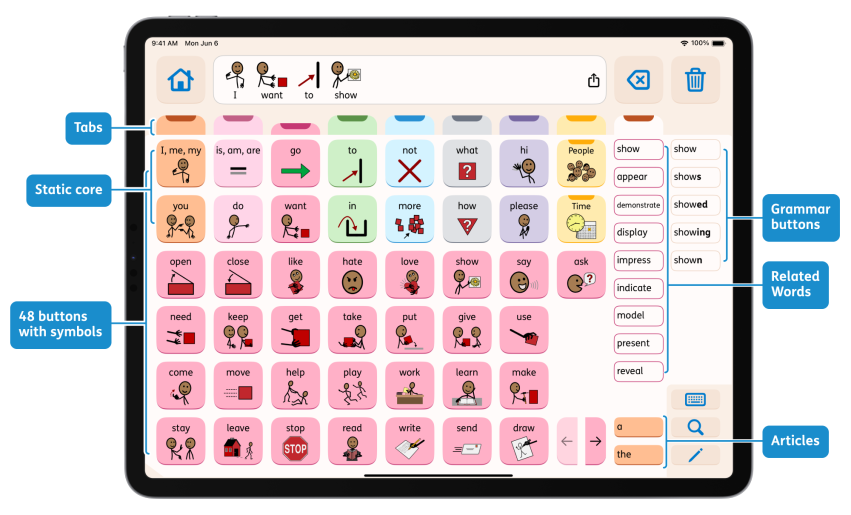
How did we make Proloquo extremely efficient
The different elements of AssistiveWare Proloquo's design

Optimization

The design of Proloquo was optimized through anonymous language use data that was collected with permission from actual AAC users. We collected word-use data from over 10,000 Proloquo2Go users and over 1,000 Proloquo4Text users. We determined which words were used by a lot of users, versus which words were used by only a few. We ensured that the most common and most frequently used words were the easiest to get to.

Proloquo’s Crescendo Evolution vocabulary is also optimized for the school curriculum. We combined our language use data with school curriculum word lists. We relied on the vocabulary classifications of researchers like Beck & McKeown, Marzano, and Biemiller. This ensured that essential vocabulary was well-represented even if certain words had lower word use.

We also tested the efficiency of the vocabulary designs. This was a two step process.

First, we collected a large range of word lists from language sample studies. We included words used by young children as they develop language. We included transcripts of actual conversations between parents and children. We considered words as they are acquired by children learning English as a 2nd language. We collected common phrases used by emergent and advanced AAC users. We included the vocabulary of elementary school curriculums. In total, we amassed nearly 70 lists, with 2,400 phrases, and a total of 16,000 words.

Next, we built a vocabulary simulator to compare different vocabulary designs. We used this simulator to measure the number of navigation steps and taps per word needed for each of the phrases and words from the collected lists. The results from simulation runs for different designs helped us make data-informed decisions on the design and organization of the words. In all instances we combined this data with research and clinical insights.

Results

Our objective was to design an AAC system with a relatively small grid size and a large vocabulary, but with maximum efficiency. We achieved this goal. Crescendo Evolution™ has a grid size of 48 buttons with symbols and 12 text-only buttons. Crescendo Evolution contains more than four times as many words as the original Crescendo vocabulary. It has a far smaller grid size. And yet it is nearly as efficient as the 96 button 8x12 Crescendo. It is more efficient than all the other Crescendo grid sizes.

Comparing Crescendo™ with Crescendo Evolution™
Vocabulary Grid Buttons Vocabulary size in
unique words
Navigation steps Taps per word
Crescendo™ 96 8×12 96 3.9K 1.6 1.5
Crescendo Evolution™ 6×8+12 60 16.5K 1.7 1.6
Crescendo™ 77 7×11 77 3.9K 1.9 1.6
Crescendo™ 60 6×10 60 3.9K 2.0 1.8

Proloquo’s Crescendo Evolution compares well with systems such as Speak for Yourself (120 buttons per page) and LAMP Words for Life (84 buttons per page). Those systems contain less than a fourth the number of unique words and most words require 2 taps.

Finally, we verified whether the new vocabulary contained the words that matter most. We returned to our word lists and language samples. We counted how many words were absent in the two AAC vocabularies. We noted how many phrases could not be completed because of a missing word. Crescendo Evolution was by far the most complete vocabulary and comes preprogrammed with over 90% of the curriculum words.

Coverage of phrases and word lists
Vocabulary Vocabulary size (in words) Coverage of phrase lists Coverage of words in word lists Coverage of words in curriculum word lists
Crescendo Evolution™ 16.5K 98% 86% 95%
Crescendo™ 96 3.9K 76% 41% 32%

References

Beck, I., McKeown, M., and Kucan, L. (2002). Bringing words to life. New York, NY: The Guilford Press

Biemiller, A. (2009). Words worth teaching: closing the vocabulary gap. Columbus, OH: McGraw-Hill SRA.

Marzano, R., (2020). Teaching basic, advanced, and academic vocabulary : a comprehensive framework for elementary instruction. Bloomington, IN: Marzano Resources.

McCarthy, J., Schwarz, I., and Ashworth, M. (2017). The availability and accessibility of basic concept vocabulary in AAC software: a preliminary study. Augmentative and Alternative Communication, 33(3), 131-138.

van Tilborg, A. (2016). Vocabulary selection in AAC: application of core vocabulary in atypical populations. Perspectives of the ASHA Special Interest Groups, SIG 12, Vol. 1(Part 4), 125-138.

Share this article

Authors

Written by