Proloquo vs Proloquo2Go
Both Proloquo2Go and Proloquo are used successfully across the disability and age spectrum, starting with toddlers. The key difference is in the design. Proloquo is engineered to build language skills by ensuring consistency across environments as the user grows. Proloquo2Go delivers comparable language outcomes when the recommended settings are used.
Both apps display symbols and words on buttons that the user taps to speak. Both apps organize these buttons in a grid.
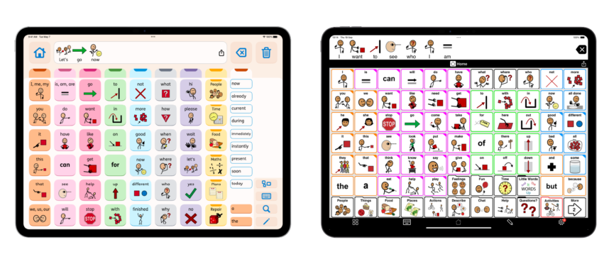
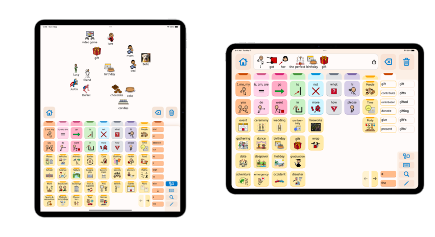
Proloquo is arranged in a grid of 60 buttons per page. These buttons are larger than the regular icons and buttons on the iPad itself. If the user can independently use apps on an iPad, such as YouTube, then they can operate Proloquo. Unlike Proloquo, Proloquo2Go’s grid can be adjusted to accommodate different accessibility needs.
Users with Proloquo, with 60 buttons per page, and Proloquo2Go, with 77 buttons per page, demonstrated the same language outcomes in our research. However, Proloquo2Go grids smaller than our recommended 77 buttons lead to poorer language outcomes. 80% of Proloquo2Go users do not follow our recommended settings. Many well-intentioned people try to make Proloquo2Go “easier” to learn, even though a large grid provides the best opportunity for language growth.
Our research shows that at least 80% of AAC users who get an iPad can handle Proloquo2Go’s 77 buttons. Even more can handle Proloquo’s 60 buttons.


 Proloquo2Go
 Proloquo


