Updated February 14, 2024
The challenge
There are many different opinions about the “ideal” AAC grid size within the AAC community. Many AAC products emphasize a large grid with many small buttons as the most efficient way to access a large vocabulary. Other AAC products offer “starter” grids with few buttons per page for beginning AAC users. Additionally, parents and AAC experts often have a different perception of the ideal grid size for a beginning AAC user. Opinions and perceptions about grid size appear to be more about personal preference and less about hard evidence.
Many parents and teachers find robust AAC systems overwhelming because of the number of buttons on the page. They wonder how a child just starting with AAC can handle so many words if they are new to AAC or still at the level of single-word utterances. Instinctively they prefer fewer words per page to get started.
Most AAC experts find more words per page better because it reduces navigation and provides quicker access to more words. It is not encouraged to start with a small grid of words and gradually move up to a larger grid. Each time the grid size changes, the user needs to relearn the motor patterns for the words they were already familiar with. Additionally, a small grid size makes modeling harder, reducing the amount of language that is modeled for the AAC user. This slows down learning.
When designing Proloquo, we considered both perspectives. What did the evidence say about the size of an AAC grid? Was bigger always better? Could we create a grid that was less overwhelming to people new to AAC? Could we identify the “ideal” grid size, one that reduced overwhelm but was also highly efficient?
Research
When AssistiveWare released Proloquo2Go’s Crescendo™ vocabulary, we recommended that users select the 7x11 grid, with 77 buttons per page. We collected anonymous consent-based data from over 10,000 Proloquo2Go users to see what grid sizes people actually use. This revealed that very few AAC users were using a 7x11 grid. Almost 80% use a smaller grid size. As many as 30% have fewer than 20 buttons per page. Most Proloquo2Go users have good fine motor and vision skills. This suggests that the smaller grids were not selected because users could not see and touch 77 buttons per page on an iPad. However, this data confirmed that parents and educators prefer smaller grid sizes.
We also used the same data to see whether larger grid sizes were better. We expected that larger grid sizes led to more and richer communication (more unique words used). Our assumptions were wrong. We found no clear correlation between grid size and the average number of daily words spoken. Perhaps even more important, we found no clear relationship between grid size and the richness of communication. Very small grid sizes were overall, as expected, showing the use of fewer unique words than larger grid sizes. Yet, the difference between grid sizes in the range of 45 to 96 buttons per page was minimal. A grid that was twice as big was not twice as efficient. It appeared that as the grid size increases, the additional benefits of a larger grid size decrease.
Finding the perfect grid size
Proloquo2Go's Crescendo offered a wide range of grid sizes. Our intent was to support different fine motor and visual needs. However, this flexibility led to people choosing smaller than recommended grid sizes. When designing Proloquo, we decided to focus only on users with the vision and fine motor skills that allow them to operate an iPad independently (open apps, select buttons) and offer only a single grid size.
We needed to find the optimal grid size. Too small, and it would be inefficient and discourage modeling. Too big, and it would overwhelm parents and educators and severely hamper adoption and modeling. The perfect grid size would be small enough not to be overwhelming. Yet large enough to allow both emergent and advanced AAC users to express themselves efficiently.
We also knew that our ideal grid size had to be at least as efficient as the 77 buttons per page that we recommend in Proloquo2Go’s Crescendo vocabulary. Anything less efficient would be a step back.
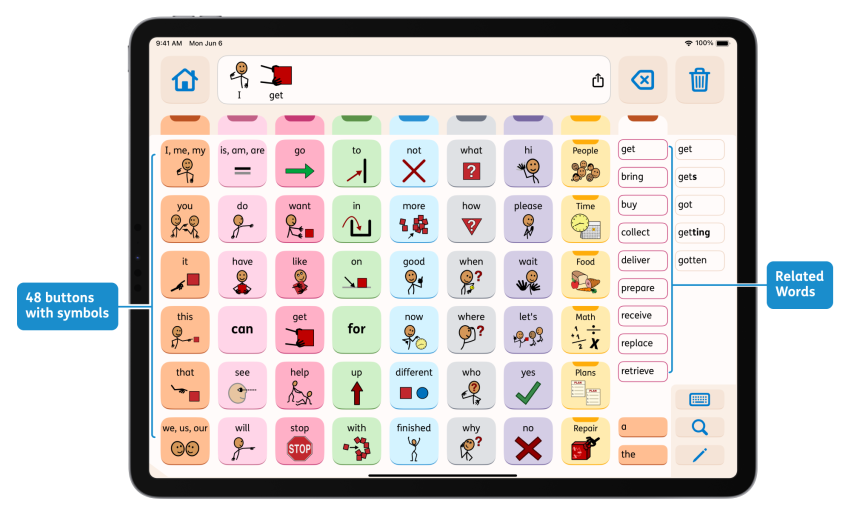
We experimented for months with many different designs. We measured the performance of each different layout. We finally settled on a design with 48 buttons with symbols and 12 text-only buttons for Related Words and articles. This formed the basis for Proloquo’s Crescendo Evolution™ vocabulary. The result is a vocabulary that provides access to more words than the original Crescendo™ vocabulary. In terms of efficiency, it is between Crescendo’s 77 and 96 buttons per page grids. This process and the resulting design are explained in more detail in a blog post on the efficiency of the Crescendo Evolution™ vocabulary.


