Choosing an AAC grid size

7 minute read

We choose a grid size on the communication device based on what the AAC user can see and touch, not based on cognitive skills, receptive language or what we think the AAC user can do.

We have chosen an Augmentative and Alternative Communication (AAC) system with a balanced vocabulary. Next, we need to choose the starting grid size for the communication device.

Many people struggle with this step. You might wonder: How many buttons should I start a communication device with? How many is too few? How many is too much?

This article will give some suggestions and ideas about what to consider when choosing grid size, including considerations for people with visual and/or physical impairments. It will also discuss the benefits of larger grid sizes, and overcoming any challenges with these.

See and touch

We should choose the grid size based on what the AAC learner can see and touch.

We should not choose the grid size based on cognitive skills, receptive language or what we think the AAC learner can do. We often underestimate the learner’s potential. This can result in starting with an AAC system with too few words.

AAC users don't need to prove themselves by first showing they can use a few buttons per page. In fact, AAC systems that only provide a few choices for toys or food we already know the learner likes can be boring. It may be more efficient to just point or reach towards the desired object. The real power of AAC is being able to expand language and communication. AAC users need to have as many buttons per page as they can see and touch. This will give them more words and more opportunities to develop language.

Fewer buttons, fewer opportunities

Proloquo2Go at 5x9 grid size
Proloquo2Go at 5X9 grid size

We often only provide beginning communicators with small grids designed for choice-making. We might think we are making it easier, with fewer buttons to visually scan and bigger buttons to target. In fact, we are making it harder to explore language and develop new skills! Words the AAC learner needs might not exist in the system. Or, if they are, it can take many steps to navigate to them in different folders.

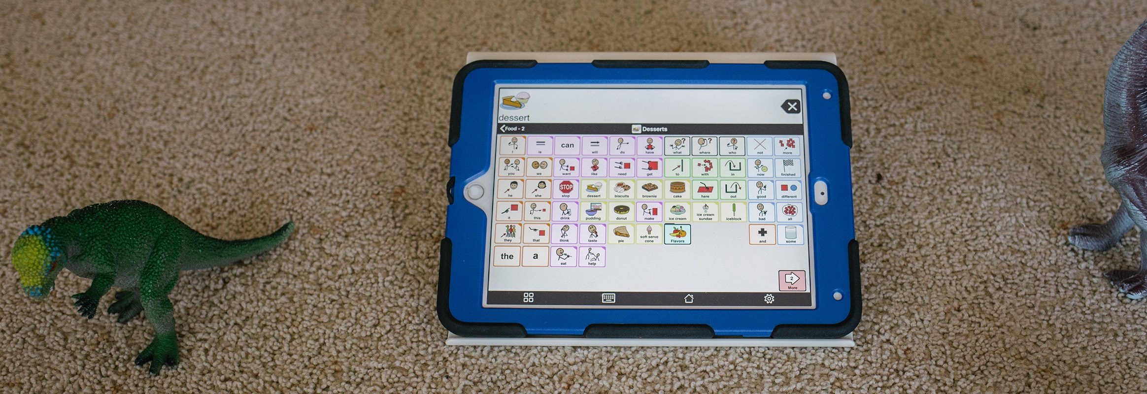
Another challenge with smaller grid sizes is figuring out what to do when the AAC learner is ready to move on. To see this for yourself, try moving up to the next grid size. You will see that the location of buttons changes. Each time we change the grid size, we all need to re-learn where the words are.

7X11 grid example AAC pictogram Proloquo2Go
Proloquo2Go at 7X11 grid size

Choosing a large grid size gives us more language on a single screen. With more language available at a glance, we can quickly recognize the words we want to use. We don’t have to remember which folder a word is in and then navigate there.

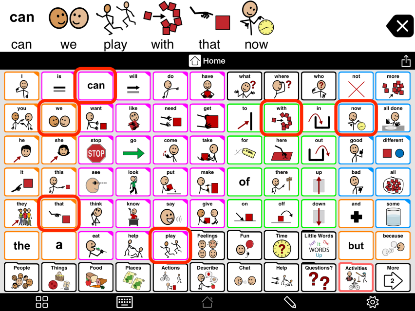
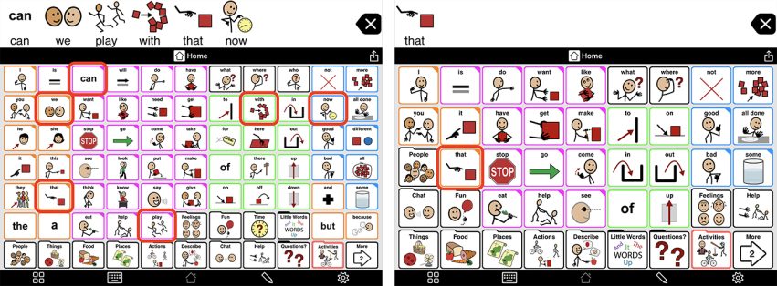
For example, it is far easier to write the sentence “Can we play with that now?” on a larger grid size than a smaller size. On a smaller grid, I can still write this sentence, but it will require far more navigation into folders to find the words.

Vocabulary keyboard examples AAC grid examples Proloquo2Go
Compare Proloquo2Go grid sizes: 7x11 vs 5x9
Giving an AAC learner MORE words is so beneficial. It gives them more to say, and allows them to build language.

Considerations for people with physical and vision difficulties

Some AAC users have physical or vision difficulties. It may take some work to find the best grid size and settings for them.

AAC learners with physical and/or visual difficulties may not be able to see and touch the buttons on a larger grid size. We may need to choose a smaller grid size.

But first, here are seven options to explore, to help maximize the amount of language available on each page:

  1. Try a larger 12.9 inch iPad Pro. The extra size may help improve access.
  2. For users who have trouble physically accessing the device or accurately hitting buttons, try using tools such as mounting systems, styluses, or key guards.
  3. For users who have a tremor or tend to accidentally brush buttons next to the one they want, try using alternative access settings. In Proloquo2Go, you can set a Hold Duration or enable Select on Release.
  4. You can also try increasing the space between buttons.
  5. For Proloquo2Go users who have visual impairments but good fine motor skills, consider using Select on Release with auditory cues.
  6. For users with visual impairments, consider adjusting the appearance so there is a higher contrast between the page background and the buttons. Increasing the space between buttons also helps them stand out better for some people with cortical visual impairment.
  7. For users with severe motor impairments that make it very difficult to hit buttons, consider scanning and switching as an access method. Proloquo2Go supports auditory scanning for users who also have visual impairments.

If you need further information on any of these options, please contact our support team.

For Help and Support articles on alternative access, please click here.

It may be a trial and error process. But if you take the time now, your AAC user can have access to more language from the start!

Feeling overwhelmed

It is not uncommon to feel overwhelmed when you first start using an AAC system with many buttons. You might be afraid the page is too busy. You might feel you need to hunt and peck to find the words you need. Perhaps you worry, how will the user manage this?

The best way to overcome these feelings is to START using the grid. Get to know your AAC system! Model as soon and as often as you can. The more you use the grid, the easier it will become. You may only model or point to one word on the grid at a time. You may make mistakes. You might not always find the word you need. This is all part of the process of learning an AAC system and modeling regularly for an AAC user. Get all team members on board and support each other as you model. Allow yourself time to learn the grid. Don’t give up too soon!

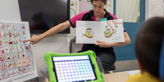
Some people find a light-tech paper copy of their grid helpful. You can print the Proloquo2Go Crescendo 7x11 core word boards and posters. Alternatively, you can make a screen capture of the home page of your AAC system and print this out to use. Many people find that they make fewer errors pointing to words and word combinations on these light-tech core word boards. It also makes it easier when you go back to use the iPad.

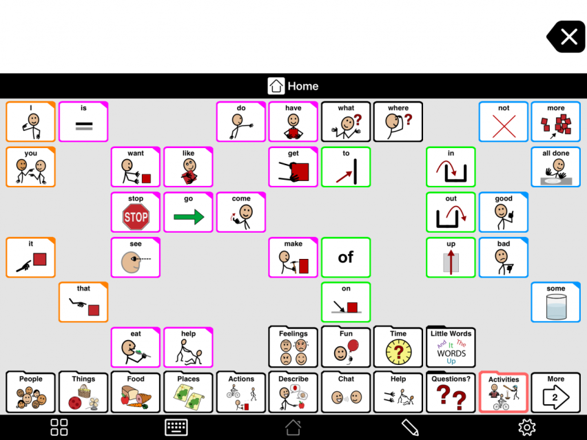
If you are using Proloquo2Go, you may try using Progressive Language, introduced in version 5. This feature allows you to hide or mask some buttons to start. As the user develops language, you can gradually reintroduce them. It is an excellent way for an AAC user to start on a larger grid size. As you reveal new words, words the user has already learned stay in the same place.
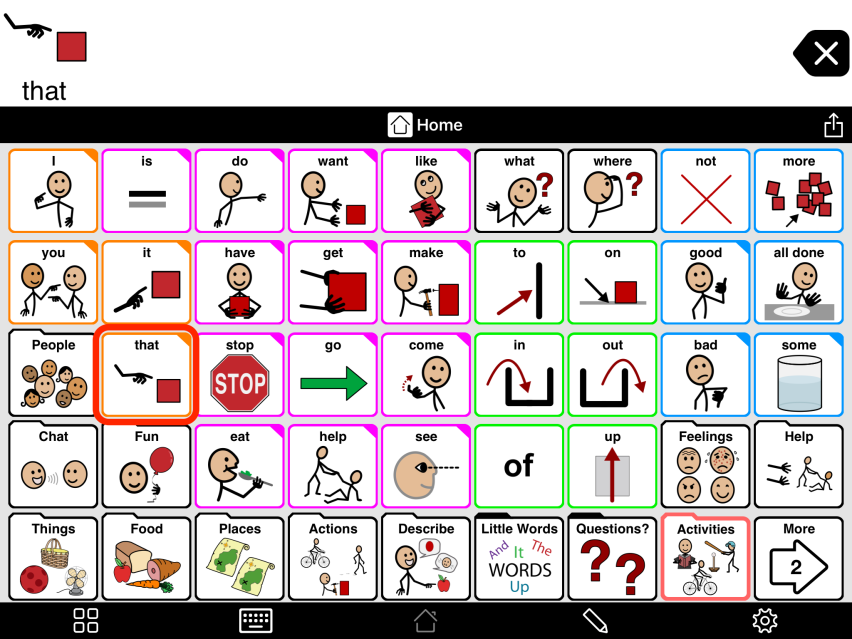
Proloquo2Go with some buttons hidden
Proloquo2Go with not all buttons visible

Changing the grid size

Are you ready to make a change? Can you change the grid size on your AAC system so the user has more words and more opportunities for language growth? Feel confident to try a larger grid size any time with a user. Play with some of the different grid size options to find the right size buttons that the AAC user can see and touch.

If you are using Proloquo2Go, you can change your grid size easily to suit the AAC user.

Considerations for PODD

PODD is another communication system you may be setting up. If you are using the simPODD app, choosing which page set works best for your AAC learner may be different. Read Erin's tips for selecting a page set in simPODD.

The next step

So much language and communication can happen on communication devices when we use large grid sizes. For our AAC users to learn how to use all the words that are now available, they need to see us use them. We model, or point, to the words as we talk to the AAC user.

Another step is to personalize the vocabulary and the system for the AAC user.

Links & References

Share this article

Authors

Written by