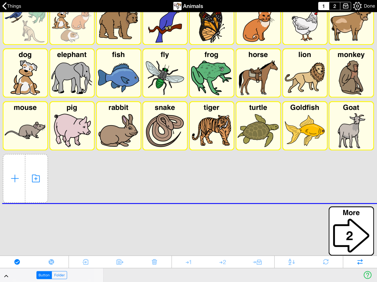
Folders can be organized in two different ways. By default, new buttons are created right after the last button in the folder. When you change from one grid size to another in the same folder, buttons will flow to fill the space available. You don’t have control over the exact layout, just the order of the buttons. The great benefit of this approach is that you will have the exact same contents in the exact same order at any grid size while the selection of core word buttons from the template will be automatically adjusted to the available space and appear in a consistent location across folders. With this kind of folder organization all customization work done on one grid size will automatically carry over to other grid sizes making it easy to expand the grid as the user’s skills and abilities grow.
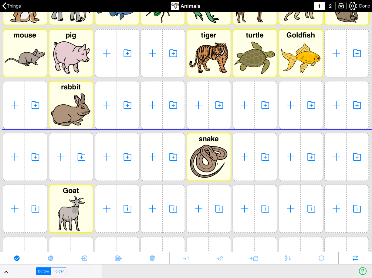
If desired, you can have more control over the folder layout by turning ON Manual Layout for Each Grid Size in Edit Mode > Folder Properties > Contents. In doing so, you will be able to position buttons anywhere you like, leaving gaps between buttons if desired. Additionally, you will be able to place buttons on top of Template buttons. This may be useful when you have created a new folder with a template but want to replace a specific Template button with another button without editing the template and influencing all other folders that use the same template.
Whilst having Manual Layout for Each Grid Size ON, you have to manually customize the layout for each grid size. Any button you add will also appear on other grid sizes, but buttons you delete or move to storage will not automatically disappear on other grid sizes. Buttons you move to primary or secondary level will not automatically move on other grid sizes too. Buttons you reposition will not be automatically repositioned on other grid sizes. In other words, you have a lot of control but also a lot more customization to do if you move between grid sizes.


