Removing navigation buttons
If the user can swipe, access the Home and Previous buttons in the toolbars, and doesn’t use Select on Release as an access method, it is simplest to just remove the navigation buttons. Here is how you can do this:
- Go to Options*
 at the far right of the bottom toolbar.
 - Go to Interaction.
- In the View section, make sure Show Paging Buttons is toggled OFF.
- Go to Advanced Options at the bottom of the View section.
- Make sure Show Previous Button and Show Home Button are toggled OFF.
With navigation buttons at the top
If you add Paging or Home/Previous buttons to the top of the grid, the arrangement of buttons in folders using templates will also change. This is because both Manual Layout for Each Grid Size and templates force buttons into an exact arrangement.
All buttons in one row of a template must always stay in the same row. Buttons that are not part of the template flow to fill the available space. The template buttons can’t keep their order if you fill up some slots with navigation buttons. Instead, everything that would usually go in the row with the navigation buttons moves down a row. The non-template buttons fill in the empty spaces in the top row.
If you don’t need the navigation buttons at the top, you can fix the changes to the top row by moving them to the bottom of the page.
- Go to Options
 at the far right of the bottom toolbar.
 - Go to Interaction.
- If Paging Buttons are enabled, go to Paging Buttons Position. Check Bottom. Then, tap < Back in the top left corner of Options.
- If you have Home and/or Previous buttons showing, tap Advanced Options in the View section. Then, go to Navigation Buttons Position. Check Bottom.
With navigation buttons at the bottom
If you have the navigation buttons at the bottom of the page, the bottom row of buttons will only show the navigation buttons. Any buttons originally in this row will move down. If you are using paging buttons, you will need to tap the Page Down button to get to the buttons that were in this row.
One way to fix this is to turn off Manual Layout for Each Grid Size in the folder. This can be risky though. Manual Layout for Each Grid Size is how Proloquo2Go knows which words to display at different grid sizes in the Home folder and folders like Action and Describing Words. If you turn off Manual Layout for Each Grid Size in a folder and later increase the grid size, you will not see new words in it.
If you do decide to do this, we recommend saving a backup first. Then, do the following:
- Tap Edit
 in the bottom toolbar to open Edit Mode.
 - Select the Folder tab to open Folder Properties

- Tap Contents.
- Toggle Manual Layout for Each Grid Size to OFF. Tap Continue when you see the warning message.
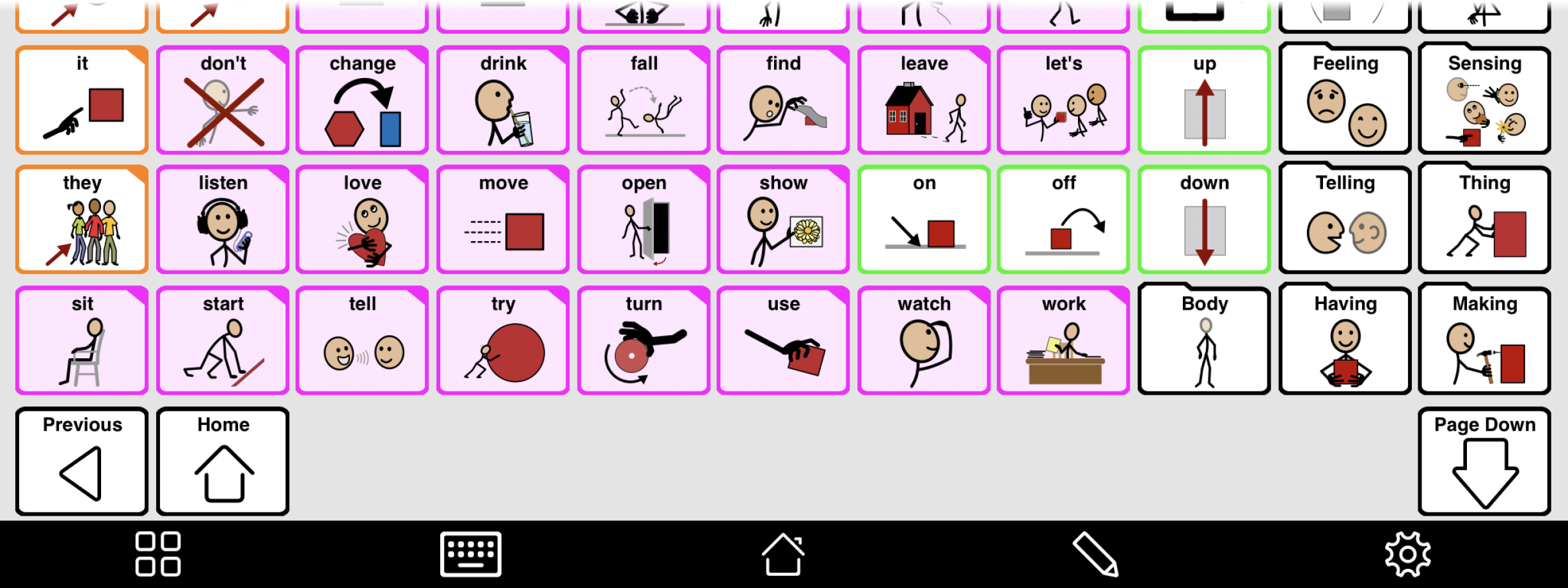
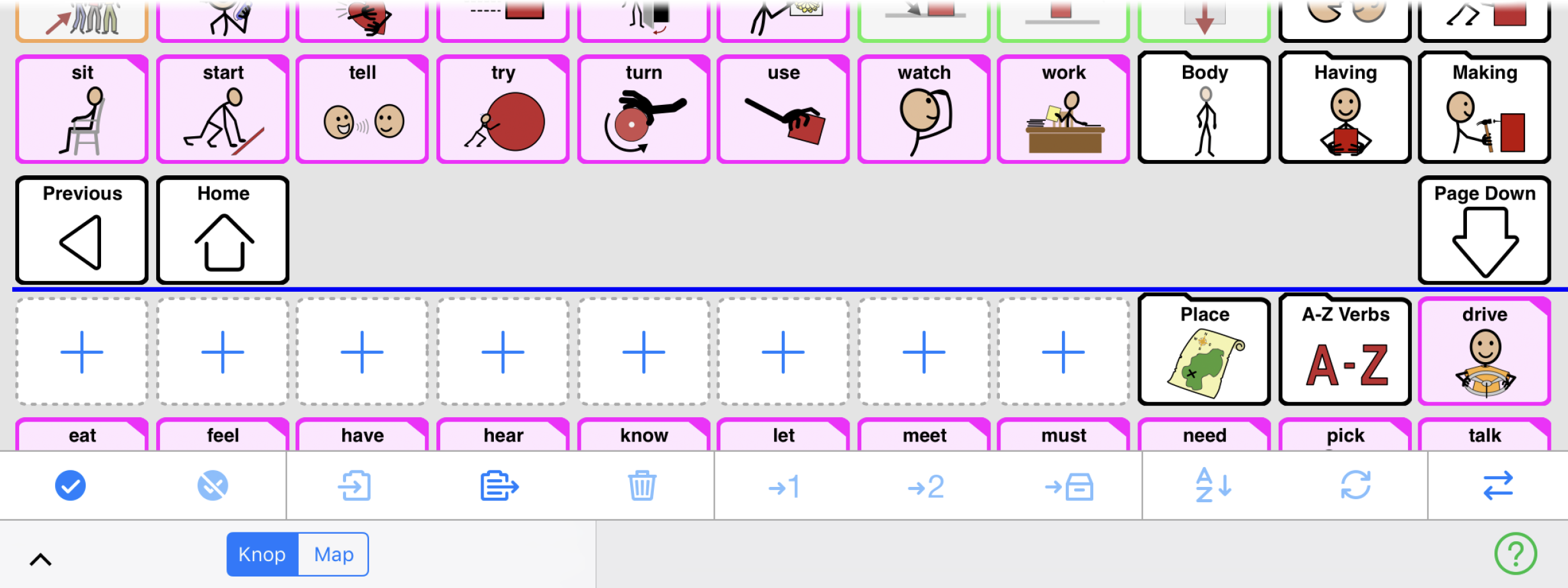
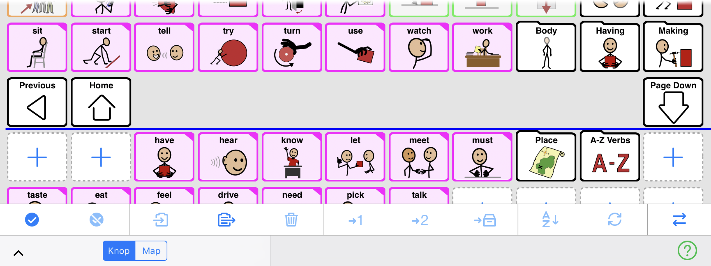
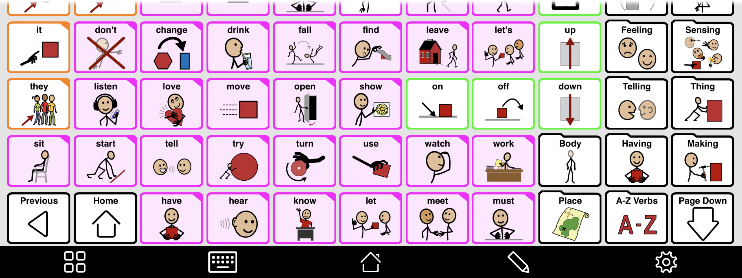
You can also move buttons in Edit Mode to make them fill in the empty spaces. You do this by making empty spaces for the navigation buttons to fill. As an example, we’ll show how to do this for the Intermediate Core “Action words” folder with a 5x9 grid size.
This is how the folder looks when starting out.


